

Cover/Story
The covers of cricket books have been a gateway to treasured stories and lore. Do they deserve to be better?


Dropping into any bookshop from October onwards and you’ll be able to spot the Cricket book offerings for the Christmas rush. You’ll get a row of faces with a closely cropped meaningful look towards the camera. A flinty stare. All are front-lit (probably by a ring light). An austere background of greyish blue or a white. A short title in a thinnish font.


If you look further into the (non-cricket) biographies section you’ll find the same front-lit faces selling ‘My Story’. Publishers are in a competitive market and need their product recognised by their audience.
Beyond the Christmas cricket autobiography cricket book covers have also suffered their own graphic relegation. Like so much cricket opinion, they are binary in their presentation. We get a cartoon illustration for a ‘funny’ cricket book. The colour scheme is inevitably green with occasional shades of blue with titles in yellow.
Graphically there are all the tropes that designers love to hate; drop-shadows, gradients, vignettes and fades all feature. Flags and lazy extractions of them are often deployed; the Indian tri-colour or a Union Jack. Book cover briefs for designers can be truly thrilling, but these books are often conservative in presentation.
So why are these covers all the same? So many look like they are done in the same studio. The reason they are so drab is a mix of economics, marketing and cultural stereotyping.
A lot of the answer is boringly obvious – these covers are ultimately advertisements in a very, very, crowded marketplace. A customer being able to spot one of these on the shelf when shopping for Kris Kringle is the covers goal.
‘There is that cricketer that retired. Dan likes cricket. It’s $49.95.’ Cha-ching.
Ok. So books need to sell and you can’t fight capitalism, I get it. But what about the art, man? It doesn’t have to be this way because it hasn’t always been like this.
Illustrated book covers are a relatively modern phenomenon. The post war ‘Mid Century Modern’ era brought art into graphic design and subsequently hand-crafted book covers into mass circulation by way of the paperback book (you can check out my take on these).
Earlier, books featured modest ‘dust jackets’ for protection between store and home. Presentation was an afterthought.

Books, posters and record covers from the post war decades were a marriage of business and art; identifying the product and attracting the reader visually.
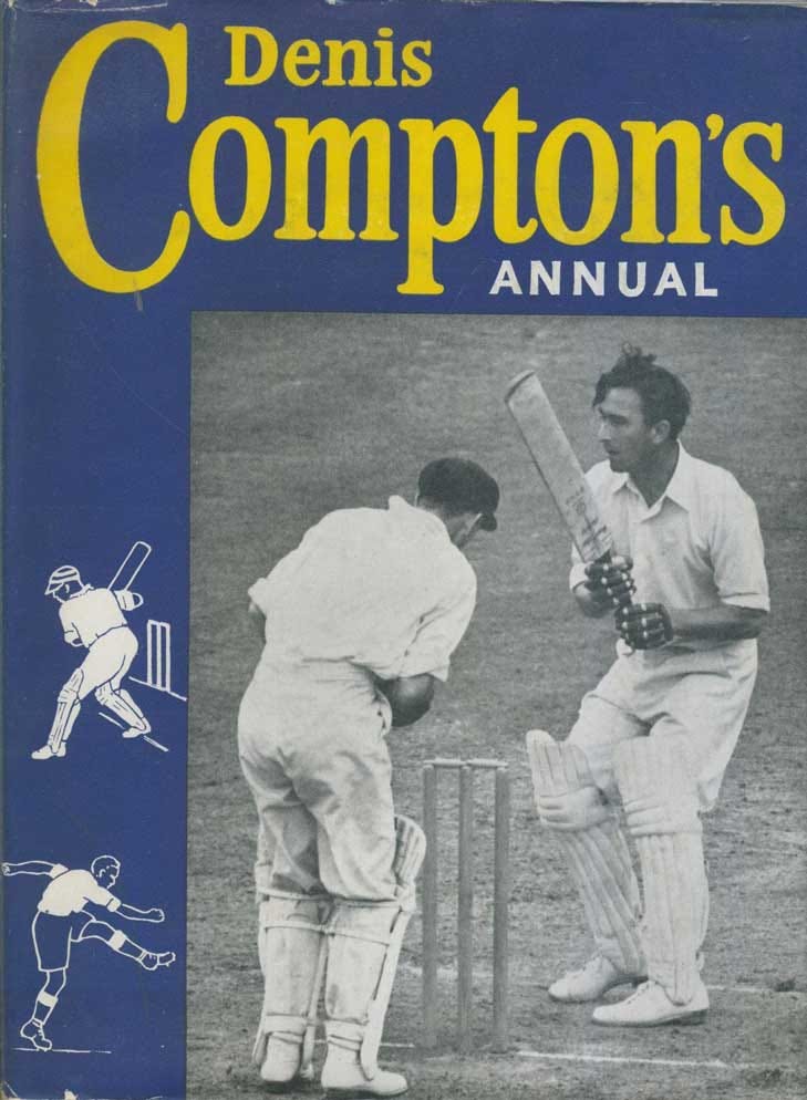
The 50’s into the 60’s brought more photography into cover design and allowed our cricketers to become not only to be recognised on shelves but a recognisable product.
‘How to’ cricket books were the original players academy; readers could get a player’s brand of skill and insights on their approach to the game. Any number of payers released their own instruction manual over the years.
Of course, in this period would come the doyen of cricket instruction ‘The Art of Cricket’ by Sir Donald Bradman.

The cover is as simple and elegant as you’d expect it to be. A restrained serif font with a range of staged shots of the Don. The cover conveys gravitas with the Don sitting comfortably above the title as if he’s about to let you in on his secrets in a quiet confessional.
Of course, it’s too easy to simply say that things were just better in the olden days. These types of books at were really the template for what we’ve been served since.
Mostly green or blue.
Features a player or cricket equipment.
Bold text.
However, the narrowness of what’s followed serves a up the trope of the daggy cover. Cricket books can be as shamefully recognisable as a split note in a brass section.
60 years on and this is the vibe…
Not exactly inspiring…
Ok, so I’ve been moaning long enough; there’s a number of excellent cricket covers, usually of excellent books.
Here’s a number that (I think) have bucked the trend.
Keep reading with a 7-day free trial
Subscribe to Cricket Et Al to keep reading this post and get 7 days of free access to the full post archives.